
How to read a graph
This short section explains how to read and understand information from a graph.
What is a graph?
A graph is a way of showing complicated information in a clear easy to understand way.
They are used to summarise complicated results.
What’s on a graph?
A graph usually has a vertical axis (y-axis) and horizontal axis (x-axis).
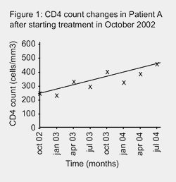
Each axis need to be clearly marked with what is being measured: time, CD4 count etc.
An axis measures data (information or results) – and can measure anything.
All graphs should have a clear title.
If time is one of the variables that is being compared, then this is always measured on the x-axis.
If the graph is being used to show data rather than just a general trend or idea, then the units being measured need to be included on a scale, ie hours or years for time, cells/mm3 for CD4 counts.
This scale needs to be shown in even measurements.
If all the results cannot be fitted on the same scale, then the axis can be broken (as in the second graph above), and the scale shown on each section.
Plotting data on a graph
Showing data on a graph is called plotting.
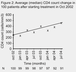
An example of how one person’s CD4 results after starting treatment could be plotted is shown in Figure 1.
To make results clearer, a line showing an average of the results is often added to make the general trend appear more clearly.
Although the actual counts go up and down a lot, the average trend in the example above shows CD4 count increasing by about 200 copies/mm3 over 18 months.
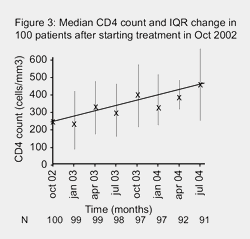
You can also plot the average results of much larger amounts of data. For example the average CD4 counts of a group of 100 people after treatment could look exactly the same.
The only difference in a graph that is showing more than one set of results, is that the numbers of people at each time point should also be included underneath each time. See Figure 2.
n = number
The mathematical term for number is n.
In Figure 2, the results are for a group of 100 people, but either not all the people have completed the study or some people have dropped out. You can see this by looking at the value for n underneath the x-axis.
If the number of participants at the end of a study is much lower than at the beginning, you need to know what happened to the other people.
Showing ranges and variations
Graphs should also show the range of variation within a group, not just the ‘average’.
This is shown by vertical lines that go up from and down from the average result that is plotted. See Figure 3.
The top and bottom of these lines often have a small horizontal line to make this clearer
This can either show:
- The full range of the results
- The range of the middle half of the results (called the Inter-Quartile Range or IQR)
- The middle 95% of the results.
The graph should state which range is being shown.
Cautions about graphs
Just as graphs can make information much clearer they can also be used to show make things look better or worse than they really are.
Scales
Always check the scale on a graph. If it doesn’t start at zero, then the change shown may look more impressive than it really is.
Numbers of people or results at any time point
If a study started with 100 people, then any average results plotted in a graph should be an average of all 100 people. If early results of a study are being shown, the numbers at each time point may much lower after further time points.
Last updated: 22 July 2009.